
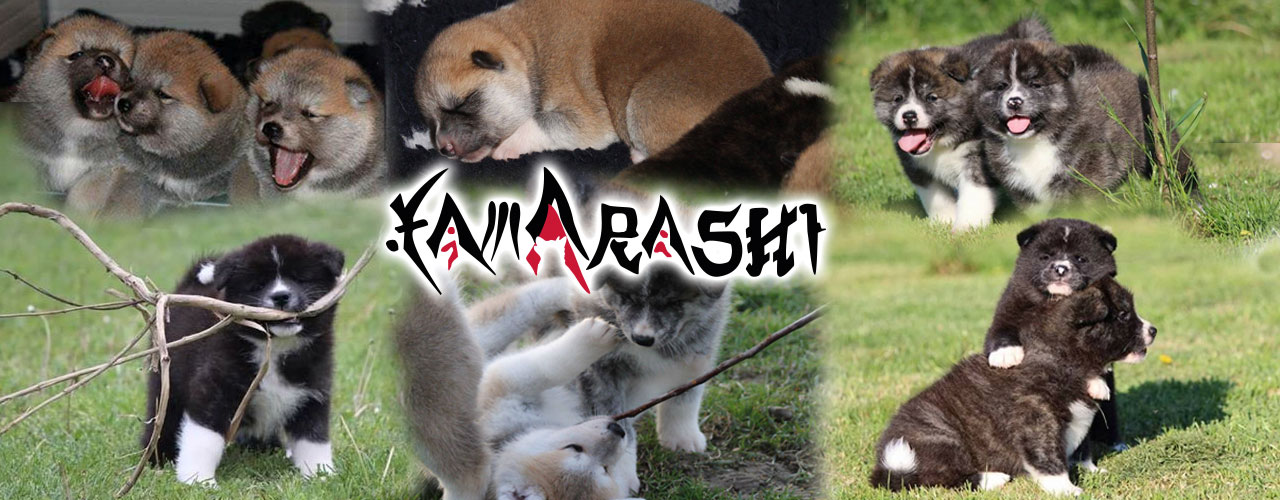

 Le origini dell’Akita, come tutte le razze giapponesi, sono antichissime...
  Le leggende sull’akita sono tantissime qui ne sono raccolte alcune...
 Non aspettatevi cuccioli che vi corrono in contro come nelle altre razze...
Dropdowns
Dropdowns are a creative way to provide more options on a click or hover element. With Uikit dropdown component, you can attach the dropdown to couple of elements to enrich your UI composition.
Button with dropdowns
To create a button dropdown, wrap the [dropdown] shortcode around a button that you'd like to add a dropdown menu, then add the dropdowm markup right after the button. Additionally, you can add an arrow icon using the [icon] shortcode to depict a dropdown menu.
[dropdown style="uk-button-dropdown"]
[button style="default" href="#" target="_self"]Dropdown 1 [icon style="icon-angle-down"/][/button]
   [nav style=""]
      <li><a href="#">Menu item</a></li>
      <li><a href="#">Menu item</a></li>
      <li class="uk-nav-header uk-navbar-nav-subtitle">Menu Heading<div>Subtitle possible</div></li>
      <li><a href="#">[icon style="icon-envelope-o"/] Menu Icon</a></li>
      <li><a href="#">[icon style="icon-heart-o"/] Another Menu item</a></li>
      <li class="uk-nav-divider"></li>
      <li><a href="#">Separated item</a></li>
   [/nav]
[/dropdown]
NOTE To use a colored menu, add the uk-color style to the nav shortcode. In this case, the uikit dropdown menu will inherit the color of the site's dropdown menu, which is set via the template settings.
Button group with dropdowns
You can also use button groups to split buttons into a standard action on the left and a dropdown toggle on the right.
[button_group]
   [button style="color" href="#" target="_self"]split button[/button]
   [dropdown style=""]
   [button style="color" href="#" target="_self"][icon style="icon-angle-down"/][/button]
         [nav style=""]
            ...menu items
         [/nav]
   [/dropdown]
[/button_group]
The following is a list of possible style options for the [nav] dropdown menu
| style | Description |
|---|---|
uk-color |
Use the main menu color in the dropdown menu |
uk-dropdown-flip |
Aligns the dropdown menu to the right |
uk-dropdown-up |
Aligns the dropdown menu above the toggle |
uk-dropdown-center |
Centers the dropdown menu. |
uk-dropdown-small |
Set the dropdown to be smaller |
[button_group]
   [button style="color" href="#" target="_self"]split button[/button]
   [dropdown style=""]
   [button style="color" href="#" target="_self"][icon style="icon-angle-down"/][/button]
         [nav style="uk-color uk-dropdown-up uk-dropdown-center uk-dropdown-small"]
            ...menu items
         [/nav]
   [/dropdown]
[/button_group]